Case Study
TGI Fridays Homepage Redesign
A brand-forward homepage built around food photography, frictionless ordering, and a loyalty program that finally feels visible on the page.
The Brief
A homepage designed to rival delivery apps
The existing Fridays homepage resembled a typical chain-restaurant site with small food images, hidden order buttons, and a loyalty program tucked away in the footer. In contrast, delivery apps have conditioned users to expect quick, visually engaging ordering experiences.
The redesign needed to meet these expectations: featuring hero-sized food images, a prominent Order Now call-to-action, and a rewards section that stands out on the page.
My Role
Visual direction + interaction design
Managed the visual design system, layout, and page flow from the hero section to the colorful deals grid and footer. Utilized existing brand assets like the logo, red color scheme, and food photography to create a homepage that competes with industry leaders.
Design Direction
Four decisions that shape every section
The whole homepage rests on four moves that recur from top to bottom.
Food-first hero
A photo of the food does more work than any tagline. The burger and fries take half the viewport and the headline plays a supporting role.
Brand-led red
Fridays red is the only accent color on the page. It's reserved for CTAs, eyebrows, and price chips — nothing decorative.
Bold display type
Heavy condensed sans set in upper case. Sized big enough to read as branding, not body copy, in every section heading.
Colored category cards
Deals, events, gift cards, happy hour — each gets a saturated card color. It's a visual shortcut so users find the right offer fast.
Above the fold
Burger first, copy second
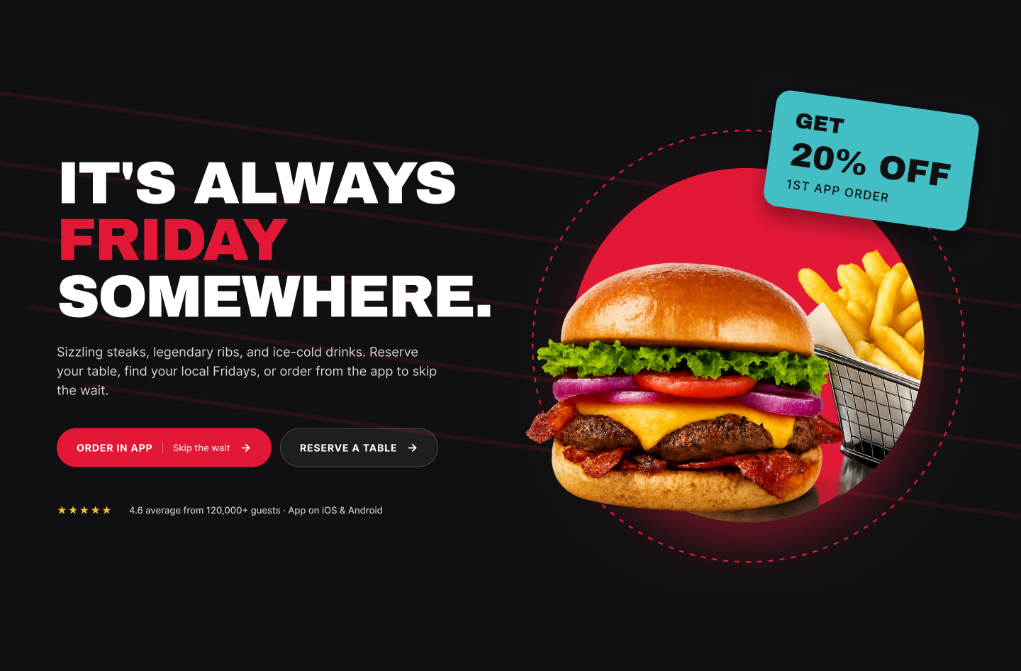
A striking food photo that occupies half the display.
The burger and fries occupy the right half of the hero. It's the first thing visitors see and the single most persuasive element on the page.
One CTA hierarchy
The 'Order Now' button is the only one in red, while 'Reserve A Table' is outlined. This visual hierarchy reflects the business priority, emphasizing conversion over reservation.
Promo chip in the hero
The 20% off first-app-order badge is integrated into the hero image, making it feel like a natural part of the visual rather than a separate banner.
Menu Preview
What's Cookin'.
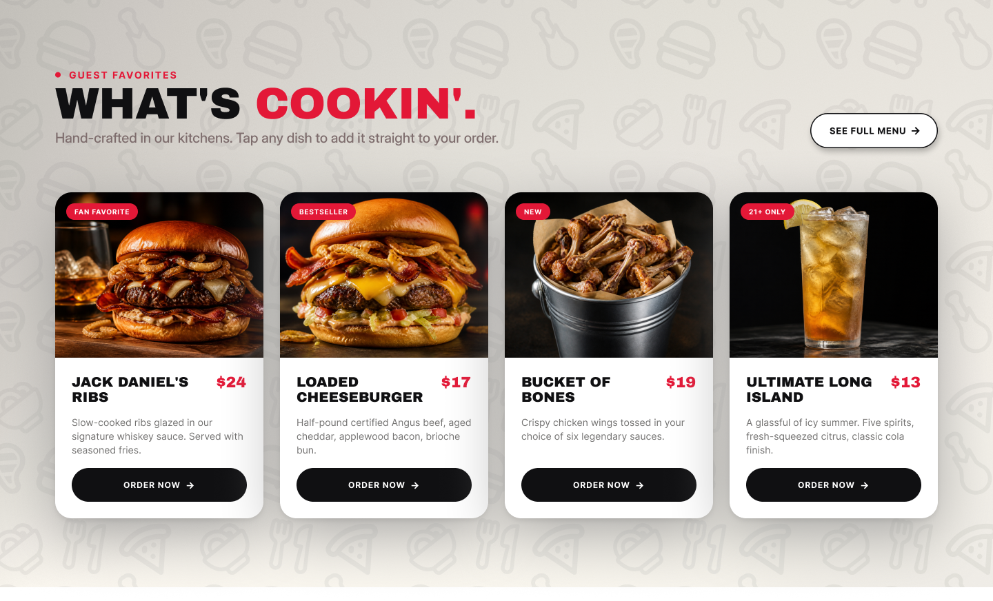
Four hero dishes
Jack Daniel's Ribs, Loaded Cheeseburger, Bucket of Bones, and Ultimate Long Island. Each dish is presented with a price and a brief description.
Sticker badges
FAN FAVORITE, BESTSELLER, NEW, 21+ ONLY. These small red badges help users quickly identify their preferences, whether they're new customers, frequent buyers, or those looking for a night out.
Order Now on every card
Each card features its own 'Order Now' button, allowing users to add items to their cart with just two taps from any dish on the homepage.
Loyalty
Rewards out of the footer, onto the homepage
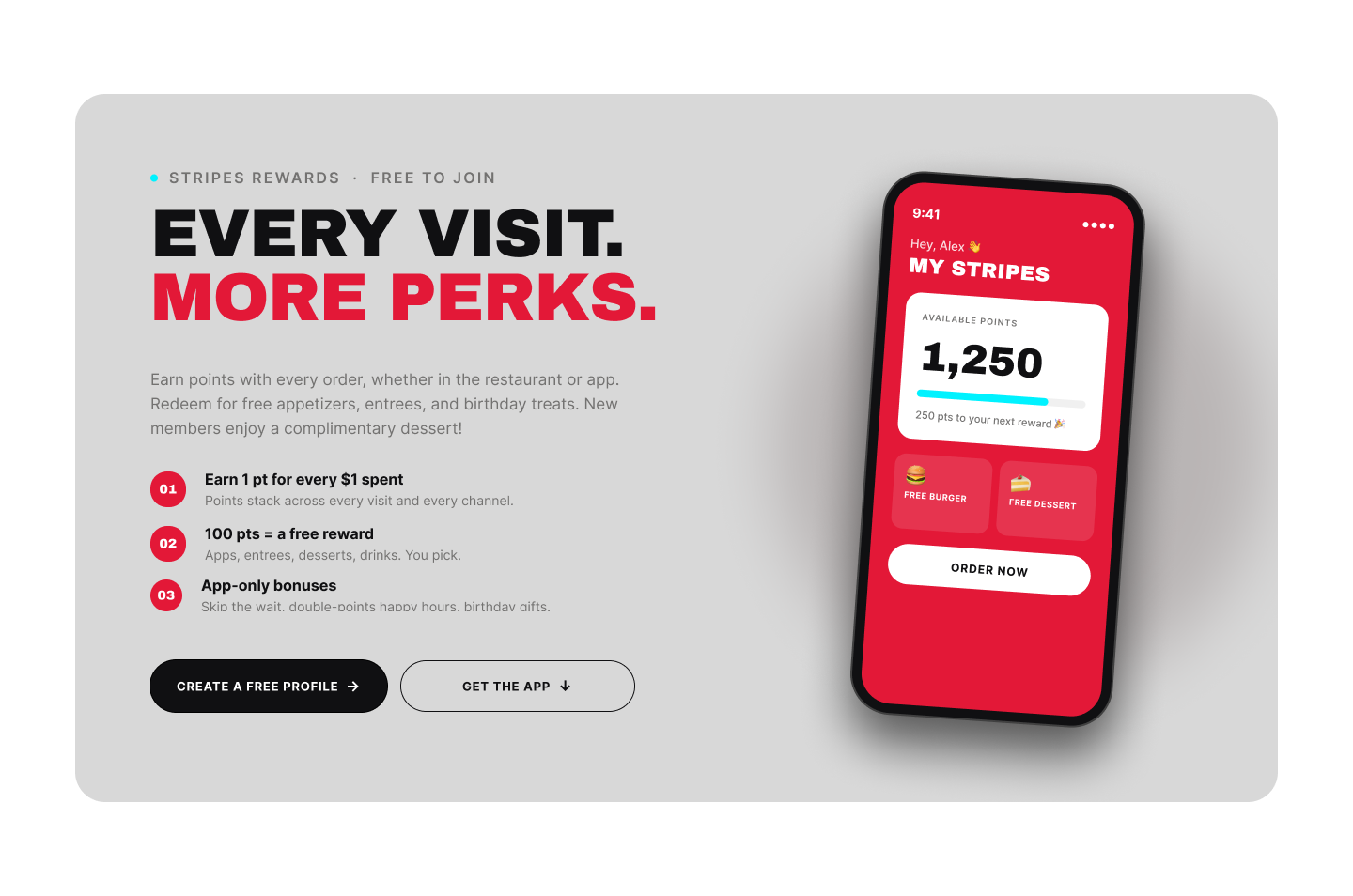
Stripes Rewards — above the fold scroll
The loyalty section is prominently placed just below the hero image, emphasizing the benefits of the program with the tagline 'Every visit. More perks.' This approach highlights the rewards rather than focusing solely on sign up.
Phone mockup as proof
A device mockup displaying a real points balance of 1,250 points provides a tangible representation of the program. It allows users to envision themselves actively engaging with the rewards system.
Two CTAs by intent
Create a free profile for desktop users, and get the app for those who prefer mobile. Both options lead to the same destination but are tailored for different user contexts.
Beyond ordering
Deals, events, and a little extra
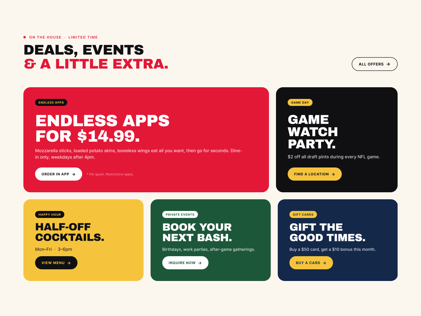
Color coded categories
Endless Apps (red), Game Watch (charcoal), Half-Off Cocktails (yellow), Book Your Next Bash (green), Gift The Good Times (navy). Each color immediately signals the type of offer, allowing users to quickly identify their interests.
Asymmetric grid
Two prominent cards at the top, followed by three smaller ones below. This layout subtly directs users to the most profitable offers, like endless apps and game day, without being overly aggressive.
One CTA per card
Order, Locate a Venue, Explore Menu, Contact Us, Purchase a Gift Card. Each card is tailored to its specific purpose, eliminating the need for generic Learn More buttons.
Supporting screens
Completing the experience
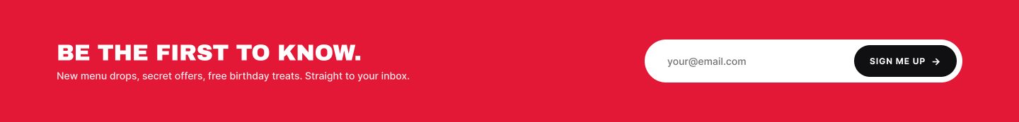
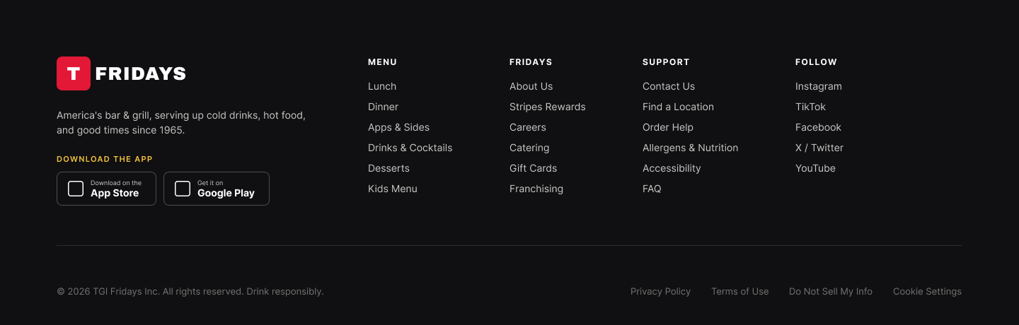
In addition to the main flow, the redesign includes enhancements to the email capture section, a four-column footer, top navigation, and interactive hover states that unify the experience.

What I'd Explore Next
Three open questions
A few decisions I would revisit with real usage data from the live site.
Sticky Order Now
Should the 'Order Now' button remain fixed at the top of the screen as users scroll? This could increase conversions, but the transition from a dark navigation bar to a light page requires careful design consideration.
Stripes Rewards placement
Does the rewards block belong above or below the menu? Above maximizes visibility for the program; below maximizes conversion for casual orderers. Worth A/B testing.
Hero image weight
The hero photo is the most compelling element but also the largest in file size. I would evaluate the Largest Contentful Paint (LCP) and consider using progressive blur-up techniques or smart cropping for smaller screens.
Reflection
The photo is the design
The most significant breakthrough in this project was prioritizing food photography as the central visual element. Many design choices, such as the dark hero section, colored category cards, and minimal typography, stemmed from allowing the photos to take center stage.
The second breakthrough was elevating the loyalty program to a prominent homepage feature instead of relegating it to the footer. By presenting Stripes Rewards as a promise of benefits rather than just an account option, it justifies its position on the page.