Using Figma Variables: A Comprehensive Step-by-Step Guide
Figma Variables represent a powerful evolution in managing design systems within Figma. They offer a streamlined way to create and manage reusable design tokens—such as colors, spacing values, text strings, and boolean states—that can be updated from a single source of truth, ensuring consistency across all your designs. This guide will walk you through everything you need to know about Figma Variables: what they are, why they are indispensable for modern design workflows, the different types available, and how to effectively create, organize, and apply them. We'll delve into practical applications like theme switching (e.g., light and dark modes) without duplicating frames and explore how variables integrate seamlessly with components and styles. Finally, we'll cover best practices to help you master design token management using this robust feature.
What Are Figma Variables and Why Use Them?
At their core, Figma Variables are stored values (like colors, numbers, text, or true/false booleans) that you define once and can then reuse throughout your designs. They act as a central repository for key design attributes – think of your brand's primary color, a standard padding value, or a button label. Once a variable is applied to various elements, any update to the variable's value automatically propagates across your entire file, and even to other files if shared via a team library.
This capability makes maintaining design consistency and updating design systems significantly easier. Imagine needing to tweak a brand color or adjust a border radius – instead of manually hunting down and editing every instance, you simply update the variable, and Figma handles the rest.
Why are variables so useful?
Consistency and Error Reduction: They serve as built-in design tokens, ensuring that elements like colors, spacing, and typography are applied uniformly, reducing the chance of inconsistencies or errors.
Efficient Updates: Changes to brand guidelines or UI patterns can be implemented rapidly by updating a single variable, saving significant time and effort.
Theme Switching (Modes): Variables support multiple "modes," allowing you to define different values for various contexts (like light vs. dark themes). This enables instant theme switching across your designs without duplicating frames.
Dynamic Prototyping: Variables enhance prototypes by allowing dynamic content changes (string/number variables) or state toggling (boolean variables), leading to more realistic user flow simulations.
Scalability with Libraries: Like components and styles, variables can be published to team libraries, allowing design tokens to be shared and maintained consistently across multiple projects and teams.
Bridging Design and Code: By formalizing design tokens directly within Figma, variables improve the design-to-development handoff, as developers can easily reference these named tokens.
In essence, Figma Variables streamline workflows, bolster consistency, facilitate complex UI states like themes, and foster better collaboration between design and development.
Types of Figma Variables
Figma offers four distinct types of variables, each tailored for specific design attributes:
Color Variables:
Stores: Color values (HEX codes for solid colors).
Use Cases: Managing color palettes, defining themes (light/dark mode colors), applying colors to fills, strokes, gradients, and effects. They are ideal for creating semantic color systems, potentially using aliasing to link theme colors back to a base palette.
Number Variables:
Stores: Numeric values (integers or decimals, e.g., 8, 16, 3.14).
Use Cases: Defining spacing units, padding, margins, border radii, element dimensions (width/height), font sizes, line heights, opacities, and grid layout values. Essential for maintaining consistent sizing and spacing, especially in responsive designs.
String Variables:
Stores: Text strings (e.g., "Submit", "Welcome User", "Roboto").
Use Cases: Managing UI copy like button labels, headings, or descriptive text. Useful for maintaining consistent terminology, managing translations (different modes for different languages), or even dynamically changing text content in prototypes. Can also be used for font family names in advanced scenarios.
Boolean Variables:
Stores: A true or false value.
Use Cases: Primarily used for controlling layer visibility (show/hide). Perfect for toggling UI elements like notification badges, optional fields, or modal visibility. In prototypes, they can drive conditional logic or switch between component variants (e.g., checked/unchecked states).
It's important to note that each variable type can only be applied to compatible properties (e.g., a Color variable to a fill, a Number variable to a width).
Creating and Organizing Variables
Setting up variables involves using Figma's dedicated Variables modal. Here’s a step-by-step guide:
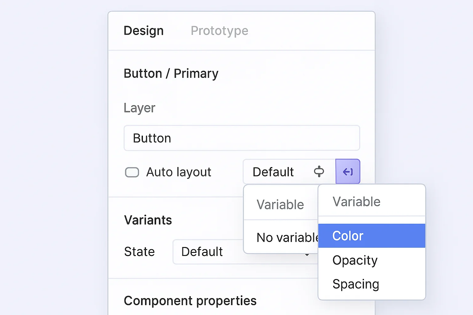
Open the Variables Modal: In your Figma file, ensure nothing is selected on the canvas. In the right sidebar, locate the Local variables section (often below Styles) and click the Open variables button.
Understand Collections: Variables are organized within Collections. A collection groups related variables and their modes. You might create separate collections for colors, spacing, typography attributes, etc. Start by creating a new collection or using the default one.
Create a New Variable: Inside a collection, click the + Create variable button. Choose the desired type (Color, Number, String, or Boolean). Figma will add a new row where you can:
Name: Give your variable a clear, descriptive name (e.g., color/brand/primary, spacing/md, text/button/label, state/isLoading). Using slashes (/) automatically creates groups.
Value: Assign its initial value in the first mode column (e.g., pick a color, enter a number, type text, select true/false).
Organize with Groups: Use the slash (/) naming convention (e.g., Color/Background/Primary) or the UI options within the modal to create groups (folders) for better organization, especially in large systems (e.g., group colors by usage: Text, Background, Border).
Utilize Multiple Modes (for Themes): Collections start with one default mode column. You can add more modes (e.g., "Light", "Dark") using the + icon at the top of the modal. This allows you to define different values for each variable under different themes. We'll cover this in detail later.
Leverage Aliasing (References): You can set a variable's value to reference another variable of the same type. Right-click a variable's value field, choose "Create alias," and select the source variable. This is powerful for creating semantic tokens that inherit from primitive ones (e.g., Button/Background/Primary aliases Color/Brand/Blue-500). If the source variable changes, all its aliases update automatically.
Add Descriptions and Scoping:
Descriptions: Add descriptions to variables to explain their intended use, aiding team understanding.
Scoping (Advanced): You can restrict where a variable can be applied (e.g., scope a number variable only to "border radius"). This prevents misuse and simplifies the variable selection process for designers
.
Applying Variables to Your Designs
Once created, variables can be applied to various layer properties via the right sidebar, binding the property to the variable's value.
Applying Color Variables:
Select the layer (shape, text, etc.).
In the Fill or Stroke section, click the color swatch.
In the color picker popover, switch to the Libraries tab.
Your local variables (square swatches) will appear alongside styles (round swatches). Click the desired color variable.
The property is now linked, indicated by a small variable/token icon in the Fill/Stroke section of the sidebar. This method also works for gradient stops and effect colors.
Tip: Use the eyedropper tool on an element already using a variable to apply that variable reference to other selected elements.
Inside Styles: You can edit a Color Style and assign a Color variable as its value, making the style itself dynamic and theme-aware.
Applying String Variables:
Select a text layer.
In the Text section of the right sidebar, click the Apply variable icon (looks like a small tag or token) next to the text content field.
Choose the desired string variable from the picker. The layer's text will update to the variable's value.
This can also be used for Font Family or Font Style by clicking the dropdown for these properties and selecting "Apply variable".
Applying Number Variables:
Select the layer.
For properties like Width, Height, Padding, Spacing, Corner Radius, or Font Size:
Shortcut: Click into the numeric input field and type = to open the variable picker.
Menu: Right-click the property label or click dropdown arrows (where available) and select "Apply variable".
Choose the desired number variable. The field will now reflect the variable link.
Applying Boolean Variables:
Select the layer or group you want to control.
In the Layer section (or Appearance) of the right sidebar, find the visibility icon (eyeball).
Right-click the visibility icon and choose the desired boolean variable.
The layer's visibility will now be determined by the variable's current value (true = visible, false = hidden).
Applying Variables to Component Instances:
You can bind variables to the variant properties of component instances. For example, if a Button component has a "Style" variant property ("Primary", "Secondary"), you can select a Button instance, find the "Style" property in the sidebar, click the Apply variable icon, and link it to a String variable (buttonStyle) whose values match the variant names. Changing the variable's value or mode can then automatically swap the instance's variant. Similarly, Boolean variables can drive binary variants (like On/Off toggles).
Using Variables for Theme Switching (Light/Dark Mode and More)
Variable Modes are the key to efficient theme management. A mode represents a complete set of values for all variables within a collection.
How Modes Work:
Instead of duplicating frames for Light and Dark themes, you create two modes ("Light", "Dark") in your relevant variable collections (e.g., Colors). Each variable gets a value for Light mode and another for Dark mode. When you switch the active mode for your design, Figma automatically applies the corresponding set of values to all linked elements.
Setting Up and Using Modes:
Add Modes: In the Variables modal, select your collection. Click the + icon next to the mode column headers to add a new mode. Name your modes clearly (e.g., "Light", "Dark", "High Contrast"). Fill in the appropriate values for each variable under each mode.
Switch Modes:
Page Level: Deselect all layers. In the right sidebar under Page, find the Change variable mode section (it usually shows an icon representing the current collection/mode). Click it and select the desired mode for one or more collections. The entire page will update instantly.
[Image: Screenshot of the Figma right sidebar when no layer is selected, focusing on the 'Page' section. Highlight the 'Change variable mode' area, showing the dropdown or button used to select the active mode (e.g., switching from 'Light Mode' to 'Dark Mode').]
Frame/Element Level: By default, elements inherit the mode from their parent ("Auto"). You can select a specific frame or element and assign a fixed mode to it in the Layer section (under Apply variable mode) if you need it to differ from the page setting.
Prototype Integration: Use the "Set variable mode" interaction trigger in prototypes (e.g., on a toggle button click) to allow users to switch themes interactively.
Modes can be used for more than just light/dark themes, such as different brand identities, density settings (compact vs. comfortable spacing), or accessibility modes.
Integrating Variables with Components and Styles
Variables, Components, and Styles work best together:
Variables in Components: Build components using variables for properties like color, spacing, and radius. This ensures instances automatically adapt to theme changes or token updates. Binding variables to variant properties (as described earlier) further syncs component states with your variable system.
Variables and Styles: Use variables inside Style definitions. For example, define a Text Style ("Heading/H1") but apply a Color variable (text/primary) to its color property. Now, the style itself becomes theme-aware via the variable. This combines the grouping power of Styles with the dynamic nature of Variables. Remember: Styles can reference Variables, and Variables can reference other Variables (aliasing), but Styles cannot reference other Styles.
Sharing via Libraries: Publish your variable collections in your team library. This makes your design tokens (variables) available across all project files, ensuring consistency at scale. Updates to library variables prompt downstream files to update.
This integration creates a truly robust design system where updates to a single token (variable) propagate consistently through styles and components across all your projects.
Best Practices and Tips for Managing Design Tokens with Variables
Primitive vs. Semantic Tokens: Structure your tokens logically. Use primitive variables for base values (e.g., color/blue/500) and semantic variables (often aliasing primitives) for specific UI roles (e.g., color/button/primary/background which might alias color/blue/500). Apply semantic tokens in your designs for clarity and easier theming.
Clear Naming and Grouping: Adopt a consistent naming convention using slashes (/) for hierarchy (e.g., Type/Size/Body/Medium, Spacing/Padding/Button/Horizontal). Good names improve discoverability and understanding.
Use Descriptions: Add context in the description field for each variable explaining its purpose and usage guidelines.
Leverage Aliasing: Avoid defining the same value multiple times. If TextColor/Link should always match Color/Brand/Primary, make the former an alias of the latter. Aliasing maintains relationships and reduces update effort.
Use Modes Thoughtfully: Modes are powerful but add complexity. Only create modes when necessary for thematic changes. Consider separate collections for theme-dependent vs. static tokens. Be mindful of plan limits on modes per collection if dealing with extremely complex systems.
Manage Library Updates: Ensure library changes (especially adding/removing modes) are published and adopted promptly by team members to avoid "mode conflicts" where files lack necessary mode definitions. Coordinate major theme updates.
Test Prototypes: If using variables for interactions or dynamic content, thoroughly test the prototype behavior, including state resetting if needed.
Clean Up and Scope: Periodically review and remove unused variables. Use scoping to limit where variables can be applied, preventing accidental misuse and simplifying choices.
Organize with Collections: Structure collections logically (e.g., "Foundation Tokens," "Theme Colors," "Spacing Scale," "Typography"). Choose a structure that aligns with your team's understanding of the design system.
Conclusion
Figma Variables offer a fundamental improvement to design system management and workflow efficiency. By embracing variables, you can ensure greater consistency, drastically speed up updates, effortlessly manage multiple themes, and create more dynamic prototypes. While there's an initial investment in setting them up, the long-term benefits in maintainability, scalability, and collaboration are significant. Start integrating variables into your process, experiment with modes and aliasing, and unlock a new level of control and flexibility in your Figma designs.


